
Ten Years of Analyzing the Duck Chart: How an NREL Discovery in 2008 Is Helping Enable More Solar on the Grid Today
How an NREL Discovery in 2008 Is Helping Enable More Solar on the Grid Today
In February 2008, a team of NREL analysts led by Paul Denholm published a paper that examined how to plan for future large-scale integration of solar photovoltaic (PV) generation on the electric grid. They observed a unique change in the shape of the electric load met by conventional power plants when increasing levels of PV are added to the system—and thus identified the earliest version of what was later named the “duck curve” by the California Independent System Operator (CAISO).
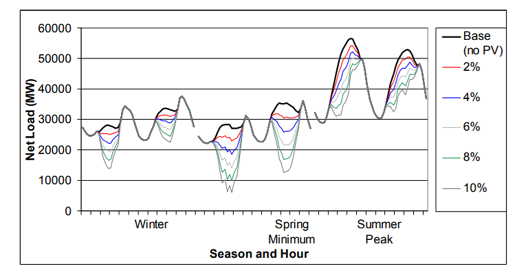
The “duck chart” in its early iteration: a figure from a 2008 paper showing the load shapes on California’s power system with various PV penetration scenarios (P. Denholm, R. Margolis, and J. Milford. Production Cost Modeling for High Levels of Photovoltaics Penetration. NREL/TP-581-42305).
Since its discovery, the duck curve has become an emblem of the challenges faced by power system operators when integrating variable renewables on the grid. It highlights concerns that the conventional power system will be unable to accommodate the ramp rate and range needed to fully utilize solar energy. On days characterized by the duck shape—in particular, during sunny spring afternoons when demand is low and solar generation is high—system operators could actually have to turn off, or curtail, some of the solar power, because conventional plants can’t be stopped and started quickly enough to accommodate it. That could mean higher costs—and ultimately limit PV’s environmental benefits.
The chart underscores the need to fully integrate distributed resources into grid system planning and operations to allow maximum use of variable generation. And today, with more state and local governments looking at policies that increase their use of advanced energy technologies—some aiming for as much as 100% electricity from renewables—finding ways to mitigate the duck is more important than ever. Fortunately, NREL has continued to develop analyses and tools to help grid system planners and operators figure out how to address this challenge.
Here’s a recap of the history of the duck chart, and what NREL is doing today to enable more solar to be integrated on the grid.
2008: NREL Releases Foundational Solar Grid Integration Analysis
The 2008 NREL report was one in a series of large-scale renewable integration analyses published by the lab over the last decade. In the early 2000s, much of the lab’s grid integration analysis work was focused on wind power, as the cost of solar was so high that few utilities considered it a viable option for large-scale deployment. But NREL analysts saw the potential for dramatic solar cost reductions, and believed it was important to examine the implications of achieving such cost reductions on deployment and systems operation.
Projecting significant levels of PV deployment in the late 2010s to early 2020s, the NREL team used a production cost modeling approach to simulate a series of PV penetrations in which up to 10% of the entire U.S. Western Interconnection’s annual electrical energy is derived from PV—producing the chart shown above for California’s power system.
2013: CAISO Gives the Duck Chart Its Name (and Fame)
Fast forward a few years, and as NREL projected, costs for solar declined rapidly. As a result, PV was deployed more widely, and system operators became increasingly concerned about how solar might impact the grid.
In 2010, CAISO began projecting the impacts of increased PV on net load (or the forecasted electric load minus the expected supply of solar power) on its system through the year 2020. In 2013, CAISO produced a chart strikingly similar to NREL’s 2008 chart—and noticing its resemblance to the profile of a duck, the term “duck curve” was born.
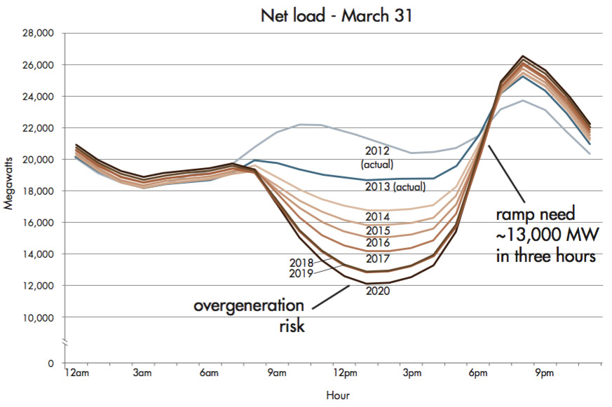
The official “duck chart” first published by CAISO in 2013 (What the Duck Curve Tells us about Managing a Green Grid).
The moniker quickly gained traction in the industry, especially with emerging energy and environmental policy initiatives pushing for higher levels of solar PV deployment. As a result, CAISO and other system operators began to identify new operating practices that would be able to balance supply and demand with high levels of renewable generation. No longer was utility-scale solar deployment a pipe dream: system operators were now acknowledging the need to plan for increasing amounts of PV in the near future, with California leading the charge.
Today: NREL Continues to Find Solutions to the Duck
Today, NREL analysis is continuing to make managing the duck curve easier. To help power system planners and operators across the nation make the most of available renewable resources, NREL analysts are now studying how different combinations of supply- and demand-side options can allow greater system reliability and flexibility with high penetrations of variable generation.
For example, this November 2015 NREL paper explored the duck chart in detail, and suggested two ways to change system planning and operational practices to re-shape the curve and allow more PV on the grid. The first is to "fatten" the duck, growing its belly by increasing the flexibility of the power system—which means changing operational practices to enable more frequent power plant cycling, starts and stops, and so on. The second is to "flatten" the duck, shrinking its belly by shifting supply and demand so solar can meet parts of the load that wouldn’t normally be provided in the middle of the day. Flattening the duck typically involves adding energy storage or demand response—both options that are already being deployed in various locations around the United States.
So fear not: the duck curve doesn’t spell doom for variable renewables. In the U.S., PV deployment is approaching the highest levels of solar studied in the 2008 report by Denholm et al. And thanks to more than 10 years of forward-looking grid integration analyses from NREL, grid planners and operators have access to a wealth of data, analysis, and tools to help get their proverbial ducks in row to manage it.
Want to learn more about what NREL’s doing to help utilities integrate ever-larger quantities of variable renewables? Other recent NREL research goes into further detail on specific solutions to manage the duck—from flexible coal to improved forecasting approaches to getting essential reliability services from PV.
Last Updated May 28, 2025